


This week, I’ll be continuing my exploration of using ink by looking at another one of my favorite artists, the fabulous Trungles! A creator based in the United States, Trungles’ art captivates his many followers on his online galleries such as his Instagram, Tumblr and Deviantart with his mastery of traditional inkwork and digital coloring.
I find myself in awe every time I scroll through one of Trungles’ social media sites. Boasting a variety of content — from beautiful Sailor Moon fanarts, tiny Pokémon Go adventures documented on Post-its and a range of Tarot card art — Trungles’ work is unified through one of his masteries: the lines he incorporates in his art. Showing an obvious control over the lines that he makes, his work can range from being chock full of details and inking techniques to simple and clean lineart. Combining this prowess with an expert’s eye in tone and coloration creates the intricate and breathtaking images that fill his galleries.
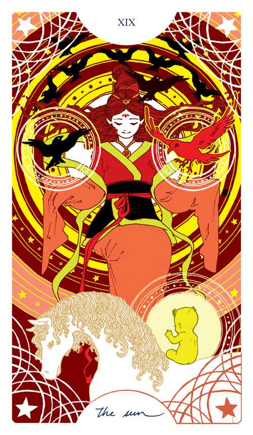
For instance, take a look at these two particular designs Trungles did for his Tarot card series:
Both cards are extremely gorgeous and showcase his inking ability; the lines in the two figures’ clothing are precise and minimalist, contrasting the complex waves of hair that have been defined by so many strands of confident and beautiful lines.
In addition, his repetition of circles give an ethereal feeling to the central figures that tie in incredibly well with the little details placed in the background as well as the color palettes he chooses for each card. (Make sure to check out the series as well his miniature Tarot set!)
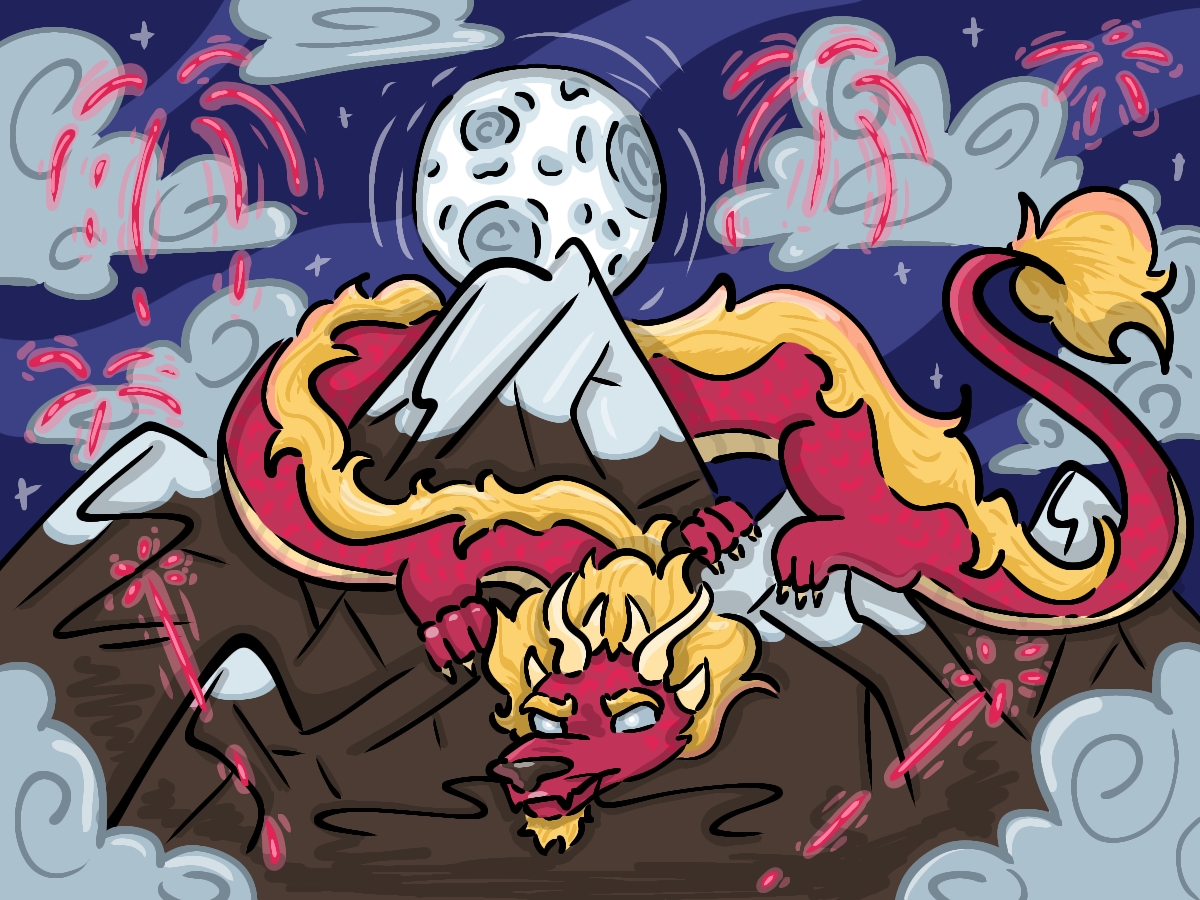
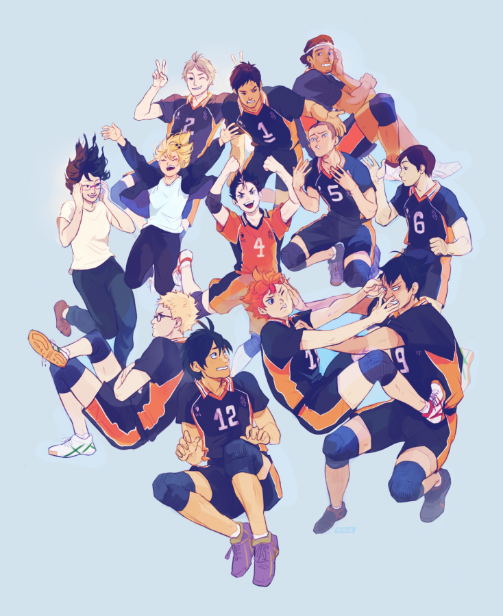
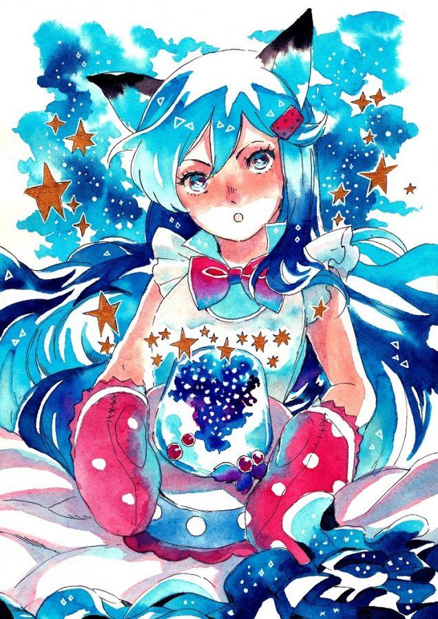
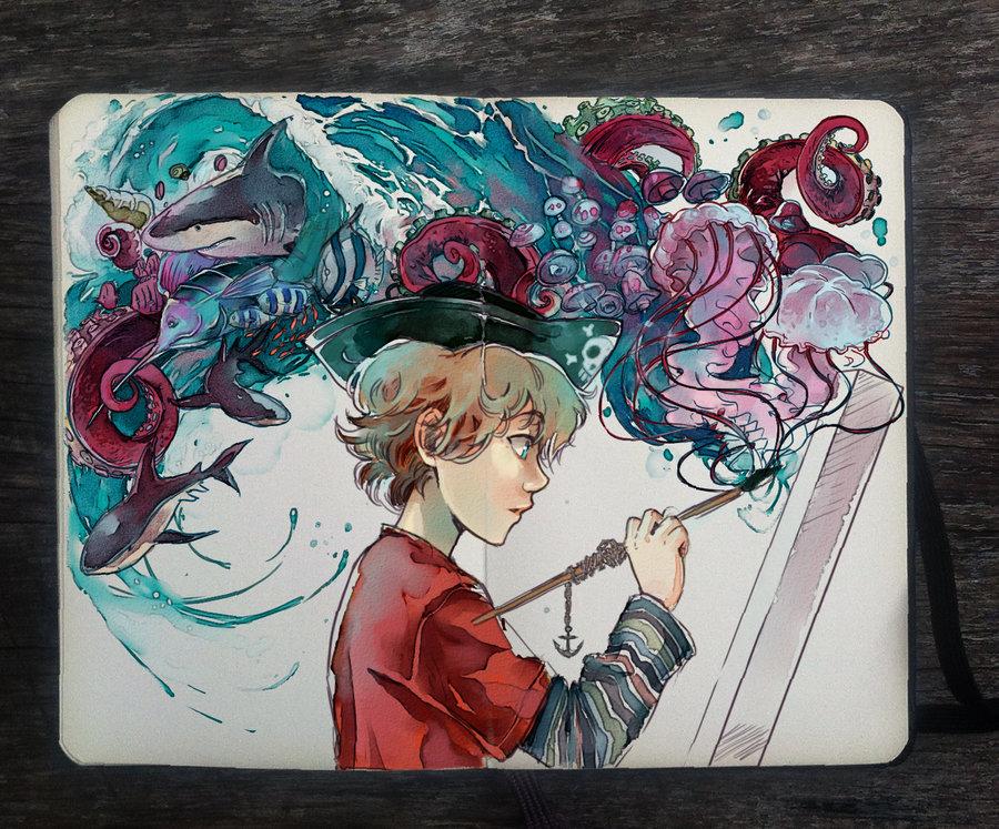
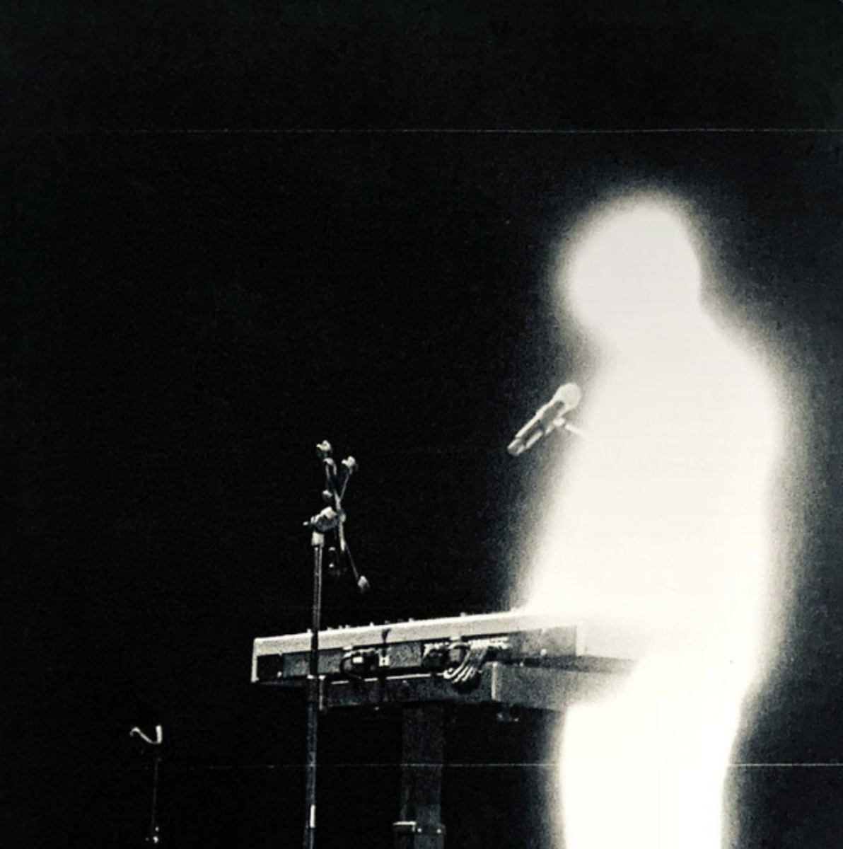
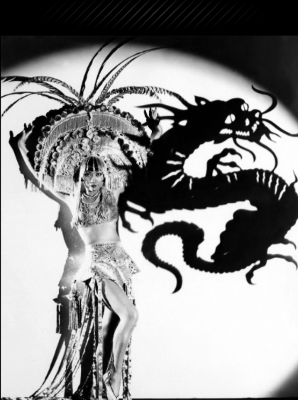
The beauty doesn’t stop there. Take a look at these pieces:


Immediately, one can notice a stark difference between these two artworks and the two Tarot cards above mainly due to the lack of color in the former. While color can be utilized to enhance different parts of a work as well as unify it through a well chosen palette as demonstrated by the tarot cards, black and white pieces limit the “distraction” of vibrant tones. By restricting the tonal variety, monochrome art places the viewer’s eyes solely on the construction of the piece, which, in Trungles’ case, are his entrancing lines. Both of these examples do just that, but different emphasis is put on different portions through a variety of techniques.
In at the top piece, emphasis is placed on the queen and mermaid through the use of a solid black background, and in doing so, brings the characters forward to the focus of the viewer. The use of complex lines also draws attention to their hair as well as to the decorative accents in the piece, creating a stark contrast with the simplified form of the mermaid’s physique and the queen’s dress. Just like any other one of Trungles’ pieces, I could spend forever following each precise line.
Now, if you look at the piece of Sailor Moon, Trungles’ style of incorporating waves of complex lines in his characters’ hair is still evident, but he showcases his mastery even further by adding additional patterns into the art. Keeping the simplicity of the figure and her clothing, he adds a few diagonal lines in the skirt. By doing so, he differentiates that portion of the piece away from the simple strokes surrounding it and brings it to the attention of the viewer.
Similarly, the collar on Sailor Moon’s uniform is also etched with tighter knit lines that distinguish it from the pattern in the skirt. These may seem like simple details, but the subtlety of these strokes is what adds an extra layer of dimension to this piece; imagine what difference it would make if the art lost those intricacies.
Just like the thousands of other people that follow his work, I find Trungles’ ability with ink and the variety of lines he is able to create incredibly amazing. As expressed in my last post, I am still working around my fear of using ink outside of experimental pieces in my sketchbook, but in addition to this fear, I have also shied away from incorporating lineart in my pieces due to my cowardice and worry of potentially drawing an incorrect line. Because of this, I have stuck to painting over lazily drawn sketches as my primary way to create art since I can always cover up a mistake with the stroke of a brush.
However, whenever I want to practice using linework, my lack of practice in this area decreases the amount of control and confidence needed in making precise marks. Refining skills takes an incredible amount of time, and learning how to ink is one such example. Because my stubbornness and impatience at this factor, I’ve distanced myself away from ink and have grown somewhat dependent on painting over mistakes in my art process. Nonetheless, I want to change that.
After digging through piles of art, I found a piece that I completed in July 2015 for a friend’s birthday that involved a stage where I had to refine a sketch and then ink it.

Although I don’t remember the entire process, I do recall how scared I was when making each stroke. Refining my initial sketch had taken long enough, but slowly going over those lines again in ink took even longer. While the strokes got somewhat obscured by the watercolor washes I painted over them, I still keep this in-progress picture because of how proud I was after finishing the linework. Using this image as motivation to add more interest into my lines, I started practicing with ink and created a few sketches with Trungles’ signature hair complexity in mind. After trial, error, and a lot of time, I ended up with this:

I was wary going into this piece of art, but I had a few set goals in mind when I started it. First off, I wanted to stick to a black and white color scheme so I could focus on practicing line variety and to avoid getting carried away with a palette. In addition, I also wanted to try out Trungles’ signature hair inking technique which was probably the biggest concern I had with the amount of complex lines involved The drawing turned out a lot better than I had anticipated it to be, although I should have done practice sketches of the two really lumpy clouds on either side of the figure. The lines that I drew in the figure’s hair could have been better thought out as well; while I did add complexity by drawing multiple strokes, the natural flow and essence of the hair could have been expressed better if I had just taken more time to stop and break down the strands. Nonetheless, I found myself having a lot of fun with the ink and putting in all of the details and patterns.
Lines may seem singular and simple on their own, but art is constructed out of them. They come in a great variety of thickness, weights, and can be grouped into a multitude of patterns — there is just so much more to a line than one might think.
Looking more in depth at Trungles’ work has added an additional layer of respect to these strokes and has opened my eyes to even more techniques that can be used in conjunction with them. While I am still getting comfortable with using ink, I am excited for the possibilities that can come out of my pen.
I’d like to thank Trungles and his beautiful artwork for inspiring me to write this post as well as continue my exploration with ink. To everyone who has made it this far in reading this week’s installment, please send him your everlasting support by checking out his website and other social media platforms! Until next time, have a gradient day, and keep creating!
All photos were used with the permission of Trungles