


This installment of Drawing the Lines features an artist who combines a wide range of subject matter with waves of soothing watercolor. PearFleur is an artist based in the United States that works primarily with traditional materials such as watercolor and ink. With a growing YouTube channel, Pear posts review videos, DIY projects, to speed paints of her work. Her videos are professional, informative and calming to watch and I love the variety of subject matter that she depicts. My follow and subscription feeds on Instagram and YouTube are filled with animators or concept artists I adore that study the human figure to feature in their illustrations of characters. Pear is one of a small group of creators that paints a wide variety of animals, plants, shapes and motifs in addition to humans. Her style of depicting such things is unique and coincides with her simple and colorful aesthetic. Invigorated with rich colors and tones, each artwork — whether it be a simple sketchbook study or a full watercolor illustration — is beautiful and intriguing to look at.
As said in my Meyoco post, watercolor is a type of paint that is activated when in contact with water. Watercolor is commonly available in pans and tubes and is more transparent than gouache or acrylic. Through layers of pigment, tones can be built up to full richness — this facet of the medium is one that Pear employs frequently in her artwork.
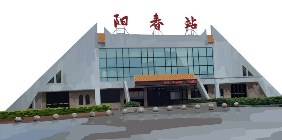
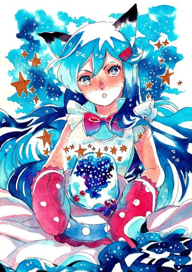
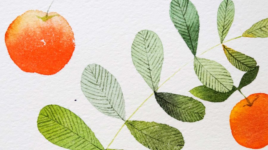
Take this piece as an example.

Pear’s progress in making starts with a clean sketch before laying the thin initial layers of blue. With the thin tip of her brush, she is able to place color right against her sketch lines, achieving clean edges on the buildings. Once these areas are dry, Pear goes back to add a second wash of color on top of the initial layer. After a background color is added, Pear also utilizes a few colored pencils to add small details and white ink to splatter tiny stars that finish the piece. (speed paint here)
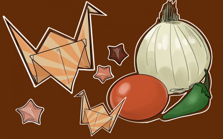
As another example, look at this painting of coral.

What immediately strikes me are the vibrant colors of the watercolors and the layers of object placement. The coral in the background softly fades into the background; the pieces in the front are striking in tone and the tiny schools of fish scattered throughout the composition contrasts against the rich colors.
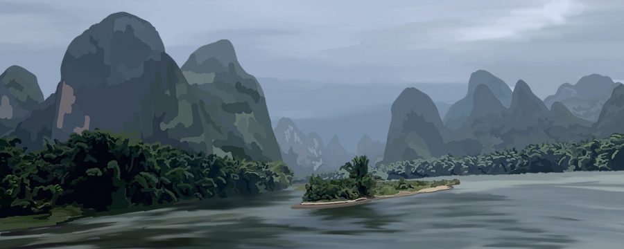
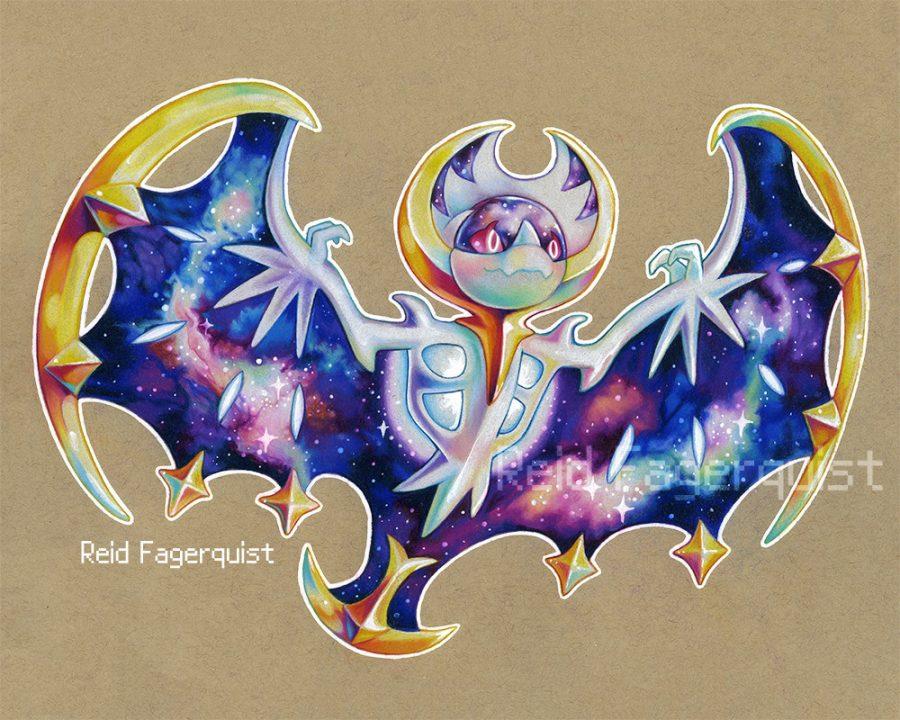
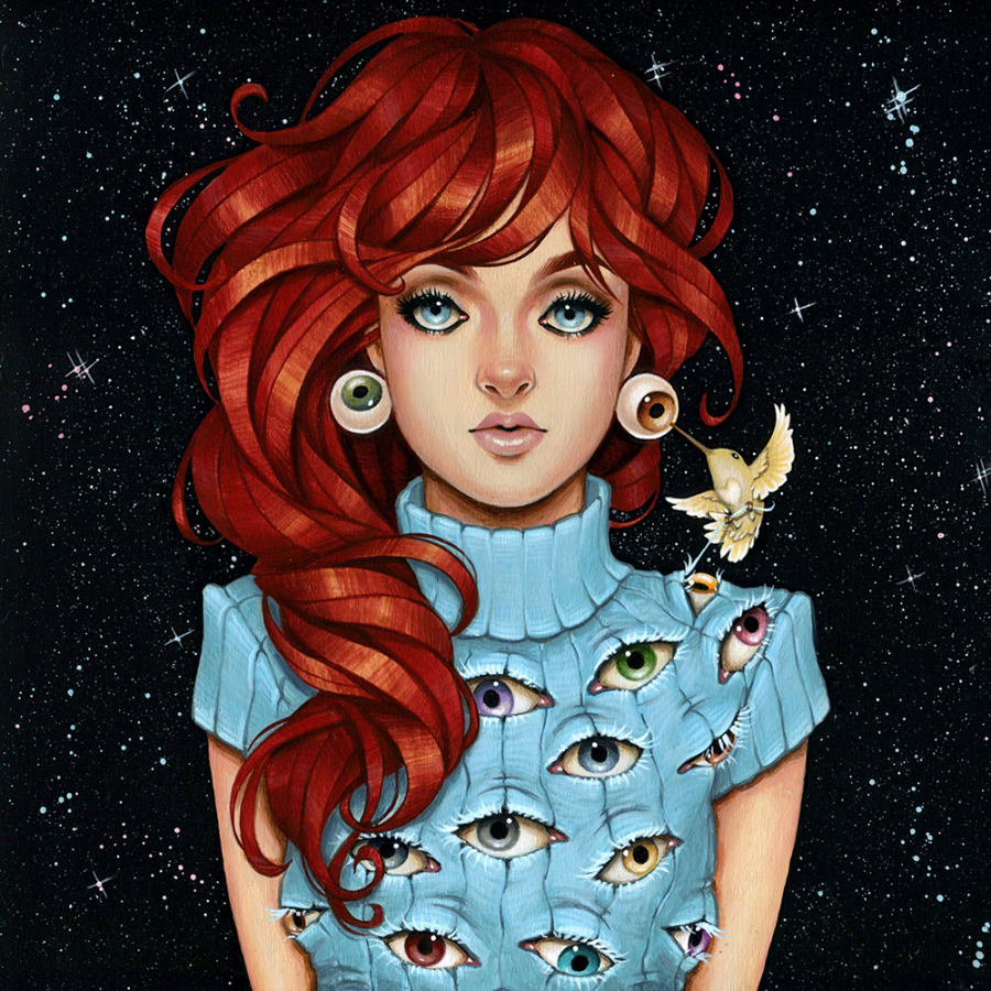
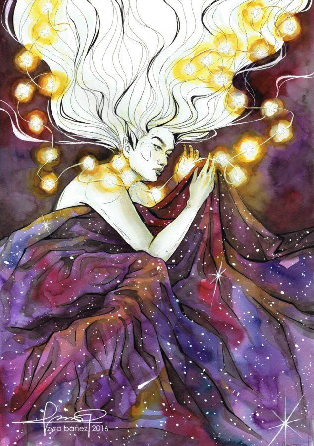
Here are some more beautiful examples of her work.


These beautiful tones originate from the watercolors that she uses, which currently is the Mijello Mission Gold set. As an artist quality paint, the Mijellos are extremely pigmented and activate quickly with only a few drops of water. The wide color range attributes to the diversity in tone and the paints are available in both pans and tubes. After seeing Pear’s review videos and speed paints using the paints, I even went and bought myself a set and can affirm of their quality and fantastic color pay off.
One such work using the Mijellos is this particular work — one of my favorites of Pear’s. In a collaboration with another YouTube artist, iraville, Pear’s part of the illustration showcases a spectacular community of fish underneath a bustling city.

Both parts are beautiful and blend their styles seamlessly. What I love about Pear’s part in particular is the achievement of depth between the far back and the foreground. While the fish that surround the central glowing bucket immediately grab the attention of the viewer, the areas around this main focal point are filled with detail. Pear layered the forests of coral on the both the left and right sides with darker, fuzzy fronds fading into the background color while those closer to the viewer are lit with the glow of the bucket. The hints of orange and red the viewer can see in some corals and in the fish complement against the overall tones of blue and add to the mystical sense of the artwork’s scene. Once again, the accompanying speed paint is informative and soothing. (Watch it here)
For this installment’s experimental piece, I wanted to get more familiar with my Mijello watercolors while trying out a method called the Negative Watercolor Technique, demonstrated in one of Pear’s videos. This particular technique involves a lot of layering and blocking out colors from the previous wash as the tones gradually get darker. To start, I first put a light layer of green across my paper and let that completely dry. Afterwards, I grabbed a darker green and painted the outlines of leaf shapes before filling in the spaces around these areas. I repeated this process over and over with tones that gradually became more vibrant and dark until I finally reached a black tone. This process was a good patience tester for me, as I usually rush into each new layers in watercolor paintings; letting each wash of paint completely dry was essential for this technique to work.

As you can see, the different layers of paint are visible and contrast well against the final black — even the first wash of light green is seen, with is something that I find especially cool. This process also allowed me to become more familiar with my Mijello paints, and overall strengthened my obsession with these beautiful pigments. Although the final product looks very elementary and simple, the practice behind this little painting what I was aiming for and I’m excited to implement this skill in future pieces.
I’d like to thank PearFleur for allowing me to write about her work! Please send your support her way by checking out her social media sites (Tumblr, Instagram, Facebook, Twitter)
Categories:
Complex simplicity, PearFleur
May 11, 2017
More to Discover