


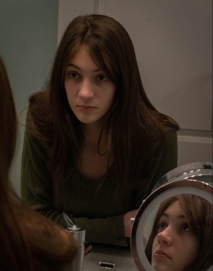


In this installment of Drawing the Lines, things take a colorful twist with our featured artist: Reid Fagerquist, or known by her online handle as Reidf, is a freelance artist based in the United States. Working mainly with Prismacolor colored pencils, watercolor and graphite, her pieces are distinctive in coloration and vibrancy and range from fan arts of Pokémon and Disney to Studio Ghibli. No matter what her subject matter is, Reid’s application of tone make her work shine.
Reid’s primary weapon of choice are the Prismacolor colored pencils, an extremely popular brand among all artists. Featuring a soft core and a wide range of tones, these pencils are able to blend easily and are applicable for all types of work. Reid usually uses these materials along with Strathmore brown toned paper.
Because the paper isn’t the same as regular white copy paper, the brown tone of the pages allow the colors of the Prismacolors to pop against the contrasting surface shade. In addition to these staple materials, Reid also incorporates other traditional mediums such as white ink, fineliners and gel pens into her pieces.
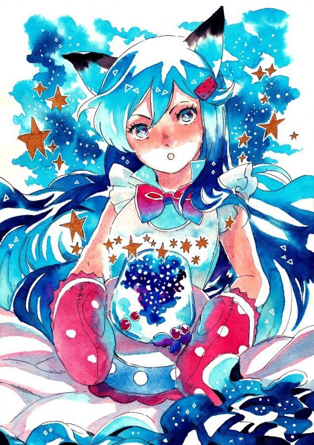
In her artwork, the colors speak for themselves. One of my favorite pieces Reid has illustrated is this artwork of Lunala from the video game, Pokémon Moon.

While Lunala and its game of origin are two things that draw me towards the piece, what immediately strikes me is how colorful the piece is. Besides the shine of the gold and the stunning galaxy effect spread in its wings, Lunala is colored thoroughly, leaving no space blank. While this piece could easily be rendered with shades of each region’s color family, the integration and repetition of tones throughout the piece is what adds a greater complexity behind its scheme.
Instead of shading with oranges and browns, the gold is accented with areas of light teal and pink; what could have been left white is given depth through usage of blues and purples.
One of the most colorful regions besides the breathtaking galaxy is Lunala’s muzzle, where every shade in the rainbow is present. Outlined in white, Lunala pops from the neutral shade of the paper and seems to illuminate. The piece is stunning because of this excellent use of color as well as the thought that went into choosing which tones to use and where to place them.
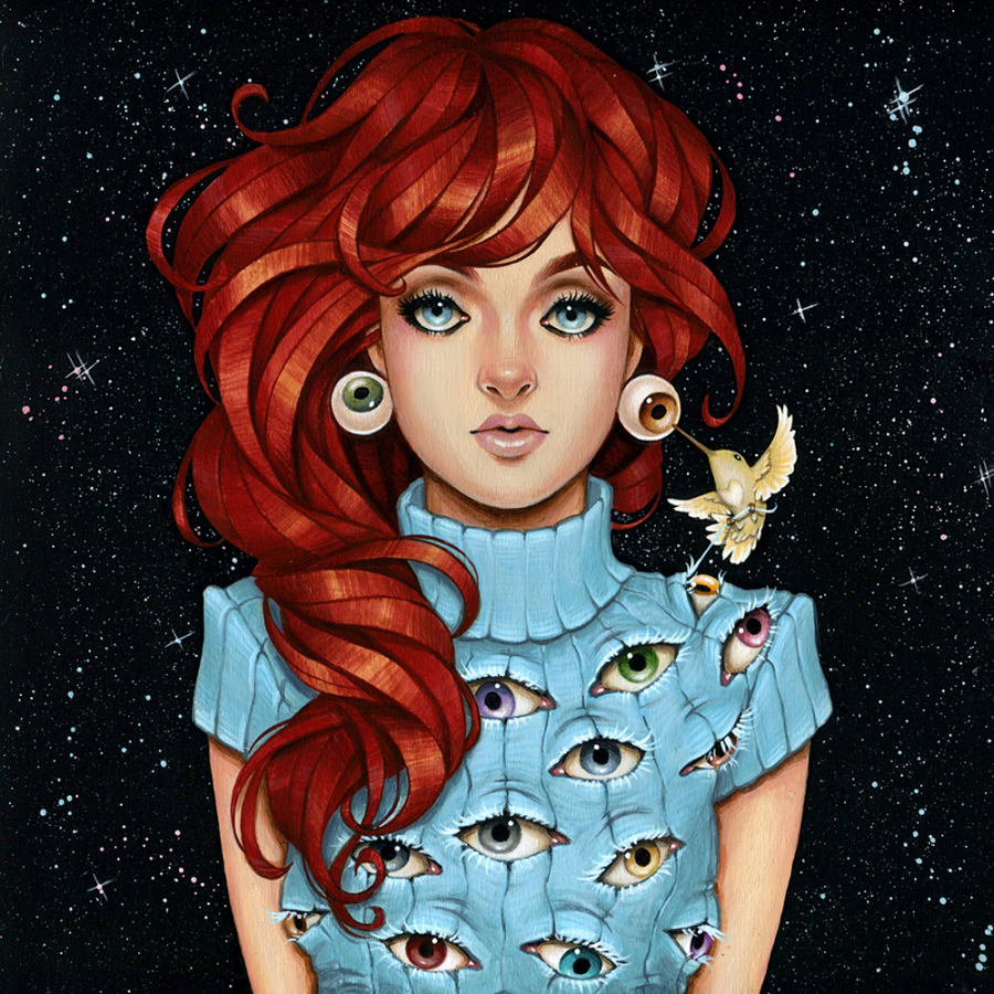
As another example, here is another fanart of the Pokémon Arcanine that Reid created.

Just like Lunala, every part of Arcanine is brought to life through the colors of the rainbow, creating a beautiful take on the Pokémon’s original color palette and design. Take time to go through the color gradations of the piece and see how each tone transitions from warm to cool, then back to warm so easily.
In addition, the smooth application of the colored pencils is another facet that amazes me. If you haven’t used Prismacolors or any other similar type of colored pencil, pressing hard with the material, blending frequently and going over areas results in smooth textures. This process is long and tiring, but can achieve the silkiness found in Reid’s beautiful work.
Take a look at some more of her pieces.
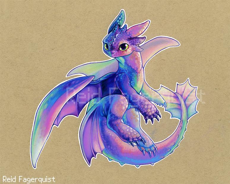
While these two still retain the silky smoothness, the shading and definition to the subjects’ scales creates an additional look of texture against the level colors. Reid’s signature use of the rainbow is evident in both, subtlely on Toothless’ chest and capturing the viewer’s attention in the dinosaur portrait; Toothless’ palette is much more cool toned and exudes a calming sense in contrast to the crazy exuberance of the dinosaur. Each palette used in every piece is different, but still retains a wide range of tone that complements the subject of each piece.
Throughout my art journey, I always wanted Prismacolor colored pencils, anxious to experiment with something other than the cheaper Crayola products I practiced with. When I finally got a set, I was ecstatic and immediately looked for the Strathmore toned papers at the craft store. It was because of Reid’s work with these materials that led me to want to utilize them together.
Still fueled by this goal, I decided to try adding more variation and vibrancy into my own coloring for this installment’s experiment piece. For subject matter, I sketched out a very simple potted plant so that I could focus more on carefully planning which tones to use as well as where they would best be used.

My initial plans for carefully laying out each color got swept aside pretty easily and I got a bit too excited with using so many colors in my practice piece. While I somewhat established a source of light from the right, I didn’t translate this factor into much of the piece, leaving the left side especially contrasting to the warmer tones. The colors don’t blend into each other very well either, and I made the mistake of mixing in a green next to a patch of red and pink on the pot, resulting in a sudden dissonance of brown in the middle. Nonetheless, it was exciting to use so many colors in a small piece and I look forward to practicing with more combinations and gradations (and actually learning more about color theory.)
I’d like to thank Reid for allowing me to write about her work! Please send your love and support her way by checking out her social media. (Twitch, Facebook, Instagram, ArtStation, Twitter) Until next time, have a gradient day and keep creating!
All photos were used with the permission of Reid Fagerquist