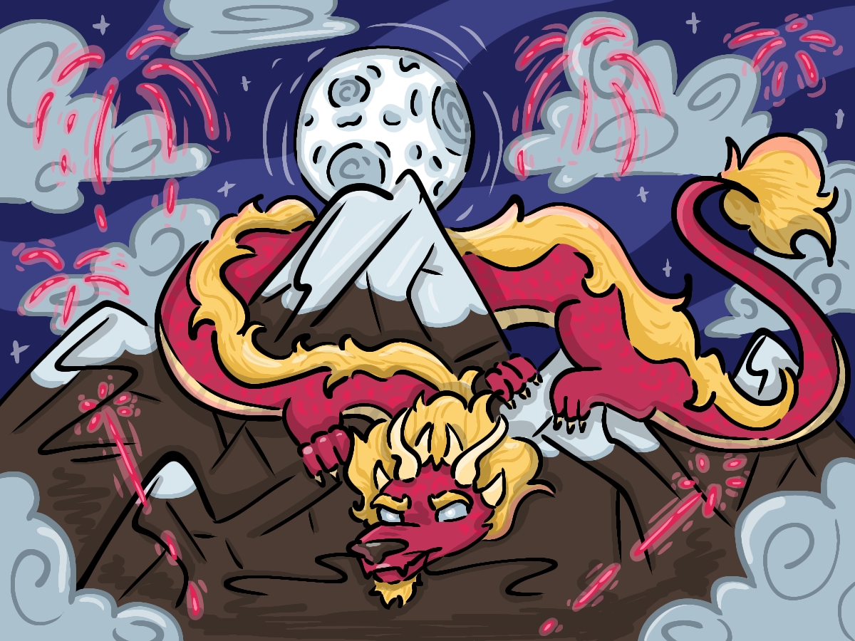


In this installment of Drawing the Lines, I will be writing about the work of another internet artist. Featured in this post is Viktoria Ridzel, also known to many online fans as Viria or Vika; She is a Ukrainian creator who is known for her digital renditions of characters from books, cartoons and movies.
While visual media like animation and film have visual reference for the viewer for setting, characters and other elements, books remain as strings of stagnant words typed across each page. When reading a book, readers visualize their own interpretations of how their favorite characters look; it is because of this intuition and curiosity that brings joy to myself as well as many others when artists like Viria showcase their own renditions of these personas and share them with fellow fans. Seeing her take on characters such as Harry Potter, Percy Jackson and other such memorable heroes of fiction is delightful to a longtime fan of such series.
Viria often poses characters interacting with one another, and I admire the way she is able to do so — depicting each figure acting naturally in both their body language and facial expression.
(top left, top right, bottom left, bottom right)
In each of these pieces, the viewer can infer what types of personalities each character possesses — even if they themselves are unfamiliar with their show or book of origin. Each pose looks fluid and genuine, reflecting human characteristics and movement. Those who partake in drawing figures will most definitely know the struggles that come with posing a characters.
I myself remember the same stagnant stance I would illustrate different characters in as a young child: consisting of a front-facing view, I posed each person standing still with little to no expression on their face — maybe a slight smile, but rarely — while their hands were conveniently placed at either their sides or behind their back. As I experimented more with drawing the figure, I found that it is extremely difficult to draw people and make them appear natural; there are many things to take into consideration, such as anatomy, perspective and lines of action.
Being able to manipulate these factors while keeping a piece cohesive is another reason while I admire Viria’s character work so much.

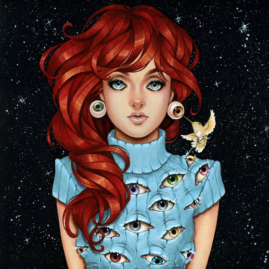
In this particular piece, I love the layers of interaction found in the twelve featured characters. While all of them can be inferred to be falling, there are subcategories between different sets of the depicted people that all fit naturally to create a coherent image.
Once again, their expressions and movement are very organic and convincing and reflect each character’s personalities, as well as the inference that they are all a part of the same group and tying back to their show, an anime focusing on the development of a high school volleyball team. Take time to look through the piece; how many different interactions can you find within the art?
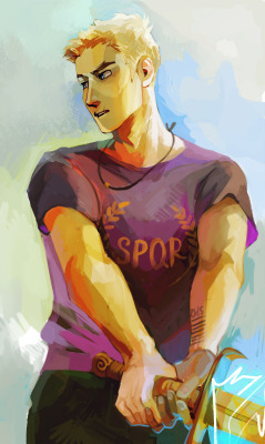

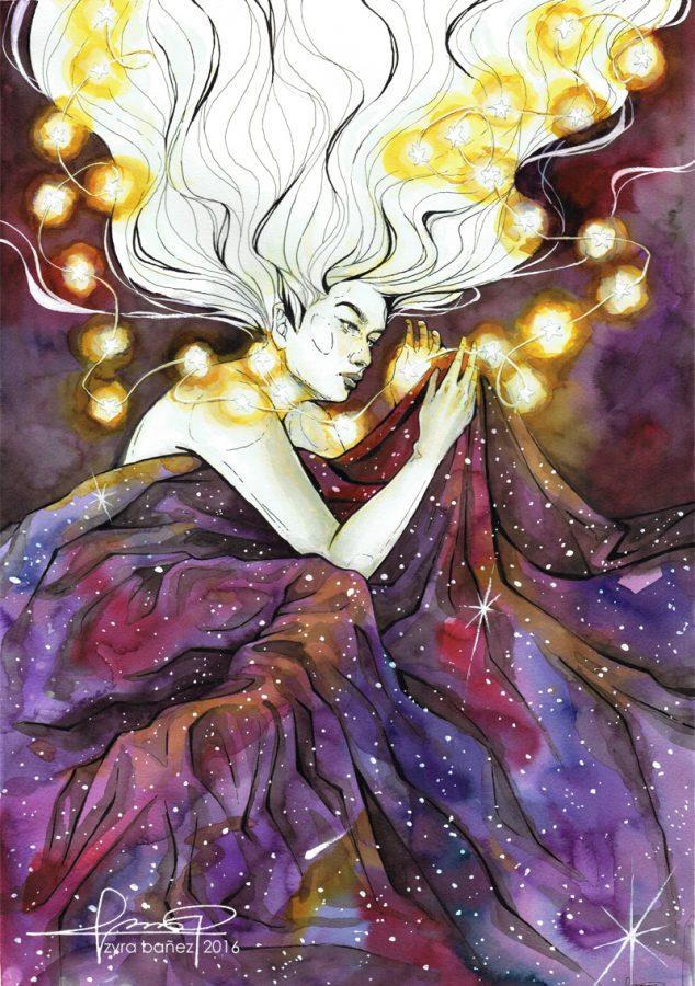
I also adore Viria’s way of coloring her pieces. Composition of linework is painted over in this style, allowing for the tones and colors to build up each work. The piece shown on the left vaguely reminds me of a holographic Pokémon trading card in the way how each color is placed in various geometric shapes. I love how shadows are accented with touches of more vibrant tones, allowing the colors to harmonize with each other and fit for the overall tone composition of character and mood, emphasizing their portrait’s subject. This piece is another one of my favorites for both the lighting as well as the textures incorporated.

These strips of color overlap each other, as seen in the stripe of brown that continues down the sleeve on the left, and the scratchy strokes on the rock add hints of light. The “striping” of colors can also be found on the figure’s pants — a subtlety that adds a natural tone of shade to the fabric. The contrast of light on the left and shadow on the right highlights the central figure, illuminating him as well. These subtleties are so slight, but really add so much depth to each piece.
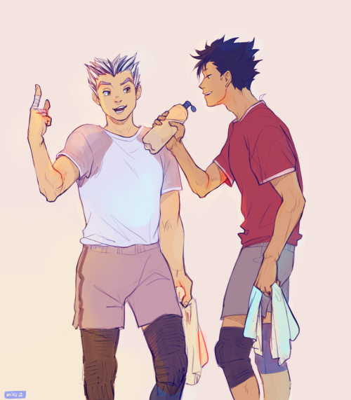
For this week’s challenge, I wanted to push myself in terms of character interaction and posing while also keeping in mind to experiment with simple coloring styles. To do so, I chose two of my own personal characters who, in my story, bicker often and bounce off of each other in multiple situations. Clean lineart, as always, was a goal I also wanted to tackle while getting anatomy as proportionate and correct as I could. With these objectives, I dove into the drawing.

Sketching out the figures was an easy task, but creating thin and confident lines was the challenge — something that I expected. Alternating between thick strokes and erasing them down, I laid out the guidelines for this quick illustration. For coloring, I kept everything simple with flats of tone, wanting to focus on the line work. The expressions of the characters was another thing that I kept in mind when drawing out the subjects. Although I think that the posing of the characters is a bit stiff, this component only serves as a reminder for further exploration of such elements in future artwork.
I’d like to thank Viria for allowing me to write about her work this week! Please send your support her way by checking out her sites! (Tumblr, Instagram, Twitter, DeviantArt) Until next time, have a gradient day and keep creating!
All photos were used with the permission of Viria