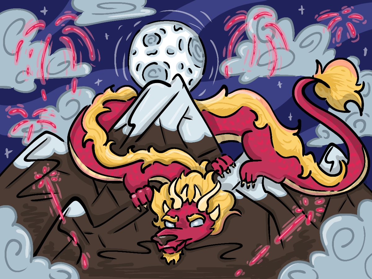
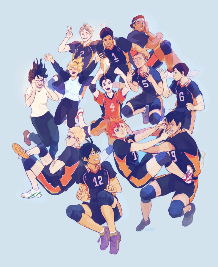
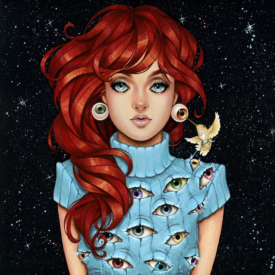
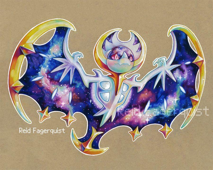
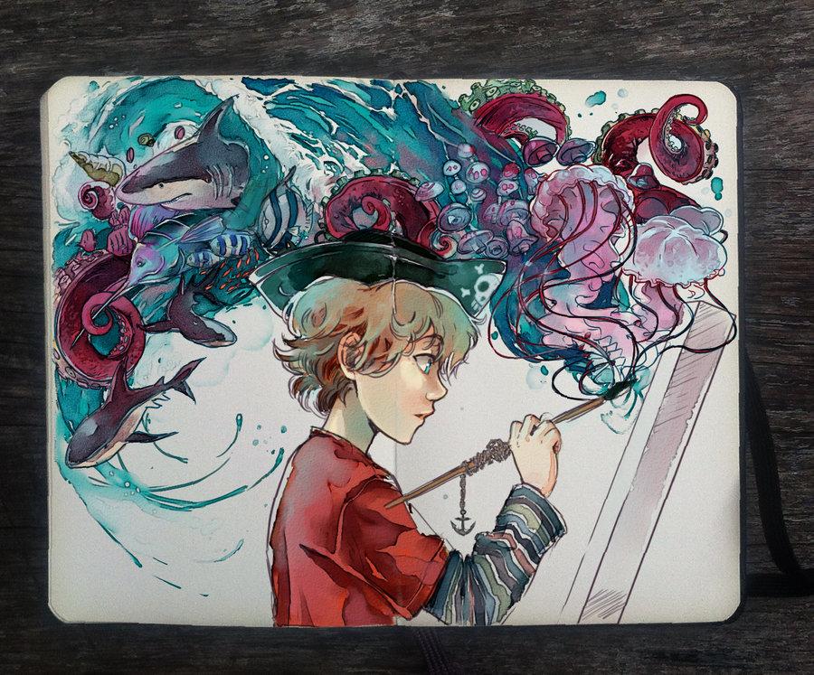
Hello and welcome back to Drawing the Lines! This week, I will be exploring the work of yet another of my greatest artistic aspirations and one of the artists that greatly influenced my own work: Meyoco. A freelance illustrator commanding ink, watercolor, and digital media, Meyo has inspired me ever since I first followed her Instagram in 2014, and ever since then, she has never stopped motivating me to create and improve. The way she is able to utilize her range of materials as well as the steps she took in developing her style still stands as a beacon of inspiration every time I see a new piece of her’s show up on my Instagram feed.
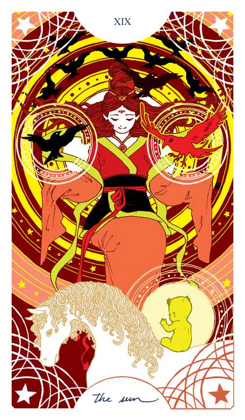
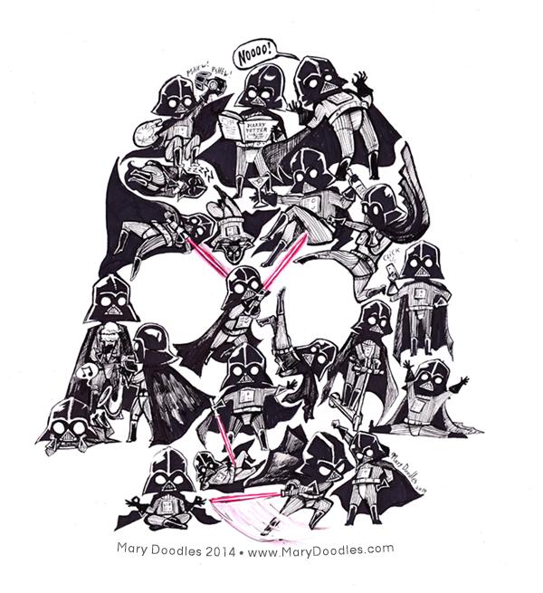
I clearly remember coming across Meyo’s gallery during my freshman year. Back then, she primarily used ink to create clean and complex lineart while I was beginning to take my own art journey more seriously. As mentioned in past installments of Drawing the Lines, linework and inking have always been techniques I struggled with, but after seeing two particular pieces (shown below) I pushed myself to draw more and more, often going to Meyo’s gallery for sources of inspiration and as a reference for how intricate linework could be.


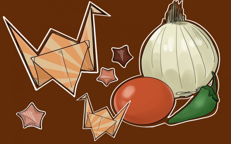
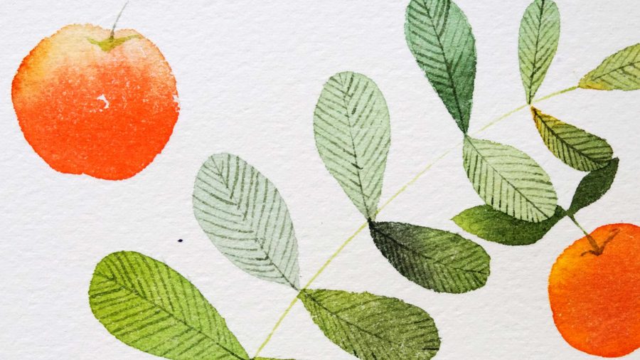
Watercolor is now, without a doubt, one of my favorite art materials to work with. For those unfamiliar with it, watercolor is a type of paint available in dry cakes, tubes, liquid formats, and even pencils and crayons. As a medium, watercolor is watered down from its original format, unlike acrylics and oils that use the paint straight out of the tube. It is also a translucent medium that allows the paper it is painted on to show through the pigment. While the paint is flexible and entertaining to use, it took me quite a while to realize how to utilize the paints to their fullest. Starting off, I didn’t know that watercolors were to be applied in thin and translucent layers, not the thick and goopy pigments that I initially laid down with the strokes of my brush. As I continued experimenting with watercolor, I once again turned to Meyo’s galleries to see her own personal exploration of how she was delving into the medium. I noted how she worked in thin layers, experimented with different bleeds and color combinations, and saw how her pieces gradually got more pigmented and vibrant. While it took some time for me to realize to work slowly and build up colors through layers, I was captivated by the practice pieces Meyo was creating as she explored her own use of the paints — not just by the technicality behind the swatches made, but by the pigments found in the paintings.
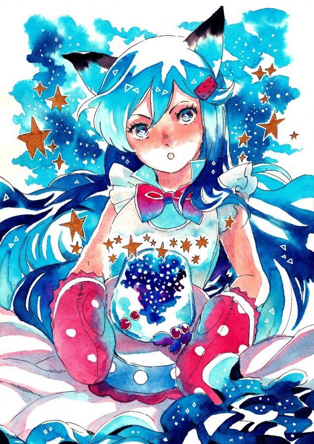
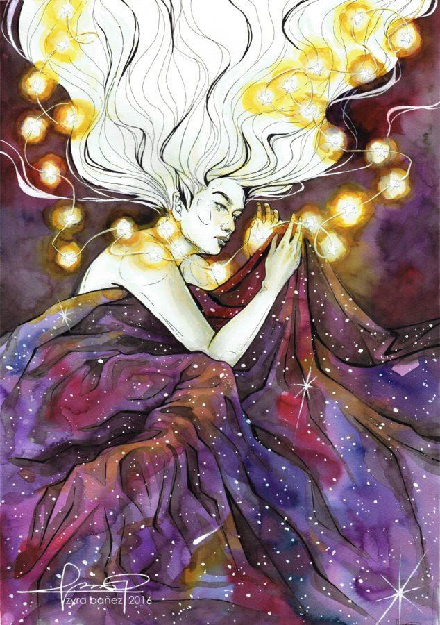
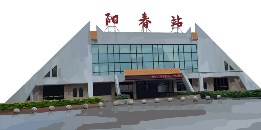
Meyo’s use of colors is another direct source of inspiration for me. Within every piece she creates, she pairs together vibrant tones of blues, reds, violets and other shades to build a palette that visually blends. While they carry a lightness due to the translucent nature of watercolor, the pigments within the paints add a pop of color that make each piece bright and powerful. Combining both her inking skill with her exploration of color, each piece is breathtaking and carries a blend of both structural and tonal harmony.


In addition to her breathtaking style, I adore the way Meyo’s aesthetic translates into her pieces, no matter the medium. Looking through her galleries, I can only describe her sense of style as a mix of calming ocean waves, pastels and plant life — all of which are showcased especially in her fashion-themed illustrations. The clothing designs are modeled by characters of her design or from shows such as Steven Universe, Bee and Puppycat, or Yuri!!! On Ice, and showcase her beautiful style.


I have always wanted to try to make a piece similar to the fashion-themed illustrations Meyo creates, and since experimenting is one major component of this blog series, I was excited to try. For my subject, I chose a character named Mikleo from one of my favorite video games, Tales of Zestiria, as I thought his affinity with water was fitting for this illustration. Color-wise, I took inspiration from the hues present in this piece.

Blue is one of my favorite colors, and I love how the vibrant tones complemented the golds in this particular piece. I also referenced the use of wave motifs in some of Meyo’s other works and attempted to incorporate them within the character’s original design.
Starting the illustration wasn’t as bad as I thought it would be. While I was still terrified during the inking phase, my practice throughout the year with previous prompts has definitely shown in the more stable lines I was able to create. When it came to painting, I was ecstatic — especially since I haven’t worked with it in a while. Taking my selected colors, I laid down thin layer after layer, working on different sections of the piece as other portions dried. After blending colors and tones together, I went over the paint with a white gel pen for extra embellishments and a glitter pen for sparkle.
Please send your support to Meyo at her social media platforms (DeviantArt, Tumblr, Twitter) and take time going through her works; you’ll need time to grasp the full beauty of each piece. Until next time, have a gradient day and keep creating!
All photos were used with the permission of Meyoco

