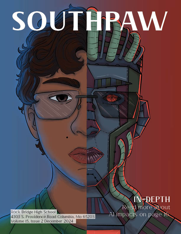
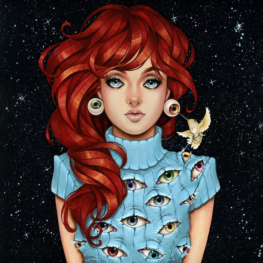
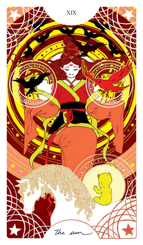
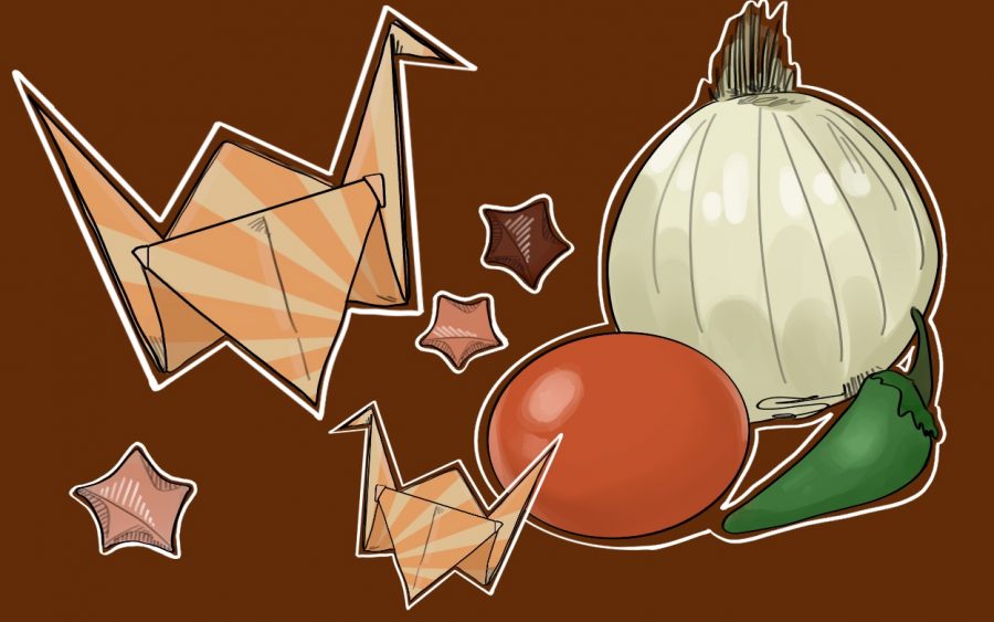
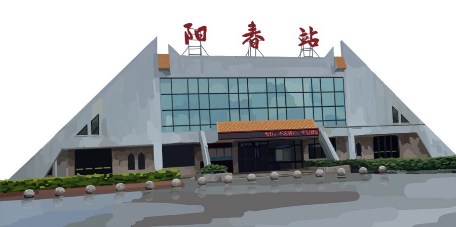
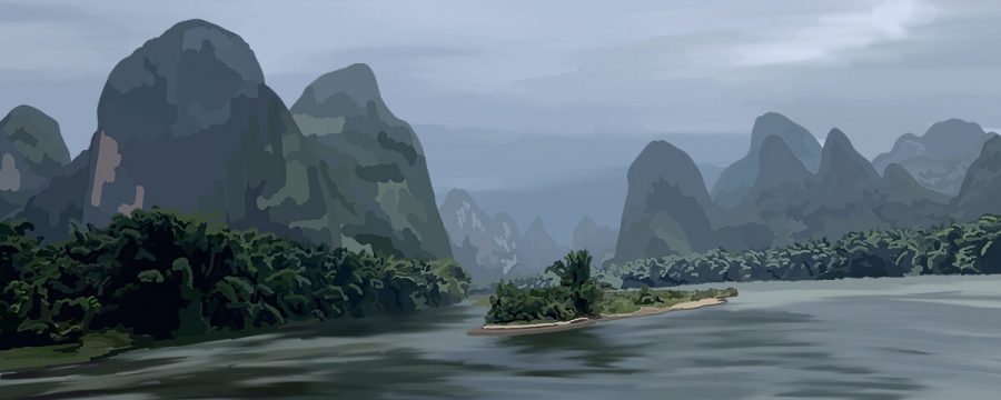
Hello again! Joanna here, and welcome back to my little corner of Bearing News! This week, I will be focusing on the work of one of my all-time favorite artists, Knight Zhang. Knight, also known by their online handle as Arucelli, is a young artist residing in the United States. Knight’s galleries on their multiple social media sites are vibrant, eye-catching and utterly gorgeous, showcasing their command of both digital and traditional materials. (check out their Instagram here and their ArtStation here!) Each one of Knight’s work seems to pop out from the screen and into reality while maintaining a fantasy edge with the lively colors and tones used.
There are a lot of things that I admire about Knight; I love their clean and effortless looking sketches, their vast knowledge of anatomy and proportion and their oh-so-gorgeous coloring style. I have also looked to Knight’s art for over three years now and see their work as one of my biggest inspirations in developing my own style as well as the skills I want to refine in anatomy and rendering. Knight’s age is another source of inspiration to me. Regardless of being eighteen — just over a year older than me — Knight’s art is on par with that of professionals in my eyes, showcasing the hard work they’ve put in their fifteen years of drawing experience and truly embodying the importance of practice and determination in an artist’s progression.
For an example of their outstanding work, here is a piece Knight did of Spark from Pokémon GO!

Knight’s hair-shading technique is another aspect that I admire. If you look closely at Spark’s fabulous locks, you can see Knight’s application of their understanding of hair: strands are grouped together into different “clumps” that flow outward from a common point on the scalp and are defined by dark shadows and eye-catching highlights that bring the hair out from the general blond tones. You can even check out Knight’s progress on this piece in the speed paint they did on their YouTube channel!
I’ve attempted numerous colored portraits like the ones Knight seems to whip out effortlessly, but I still have a lot of work to do. After digging through my endless folder of old work, I found a few examples to analyze.


Inspired by a conversation I had with one of my best friends and fellow Bearing News member, Kristine Cho, I decided to use Rose from Tales of Zestiria (one of my favorite video games) as my subject matter for the piece. Her color palette seemed perfect for practicing shading since it incorporates a lot of vibrant red tones in her hair while balancing out this liveliness with the dark greens of her jacket and neutrals in her complexion. I was excited to paint her since she was one of my favorite characters from the game, but I was even more ecstatic to see how I could apply Knight’s painting style to a sketch of mine. After settling into my usual spot at my favorite coffee shop, downing an espresso and turning on some good tunes (this week I listened to the Tales of Zestiria soundtrack — particularly disc three) I started to paint!

Once again, I have to thank Knight and their beautiful creations for always giving me endless inspiration to better my art and reinforcing the importance of determination and practice in order to grow. To anyone who made it this far in reading this week’s post, please please please go and send your support to Knight by subscribing to their YouTube channel and following any of their social media sites! Until next time, have a gradient day and keep drawing!
All photos were used with the permission of Knight Zhang

