


Hey there, fellow citizen of the internet! Thanks for coming over to my little corner of Bearing News. My name is Joanna, and I am one of Southside Media’s artists.
Like a great number of other artists in the world, I consider myself self-taught. Without a “formal” art education, I turned to the great World Wide Web to draw inspiration from the multitude of artists that have made themselves known through social media sites like Instagram, Facebook and DeviantArt.
In this blog, I will be highlighting some of my favorite artists and what I love about their style before attempting to integrate what I learn from them into my own work!
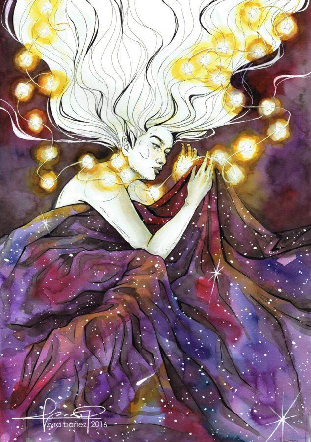
First up is Miguel Mercado, an artist based in the Philippines whose jaw-dropping digital paintings look like they belong in a posh little gallery in Paris. (Check them out here!) He has done a variety of work ranging from beautiful fanarts of Sailor Moon, Overwatch and Pokemon Go, stellar interpretations of the Marvel and DC universes, to his breathtakingly beautiful original paintings. Focusing mostly on the human figure and portraiture, his emphasis on tone, expression and lighting can be found throughout all of his pieces.
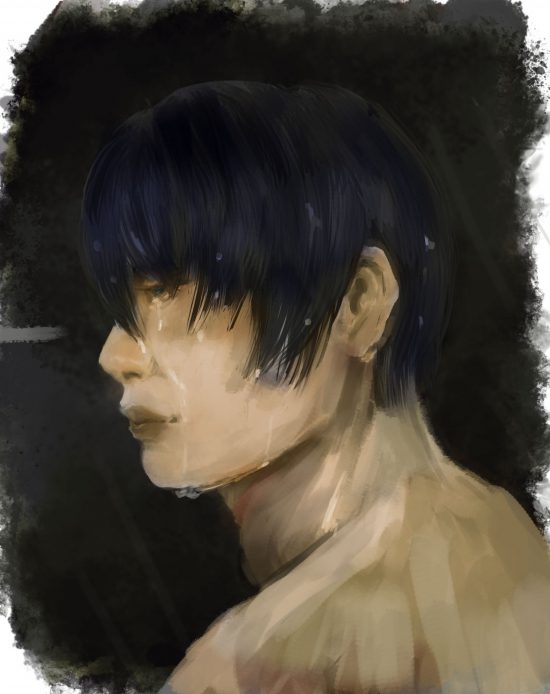
One thing that I love about Miguel’s style is the values in each artwork, or in simpler terms, the lights and darks of his colors. Take this value and lighting study he did for instance: (original)

By only working in black and white, he is able to greatly emphasize the importance of light and shadow to define the figure. A certain ambiance is created by the simplicity of the grey tones as well. (Plus, the portrait is just gorgeous.)
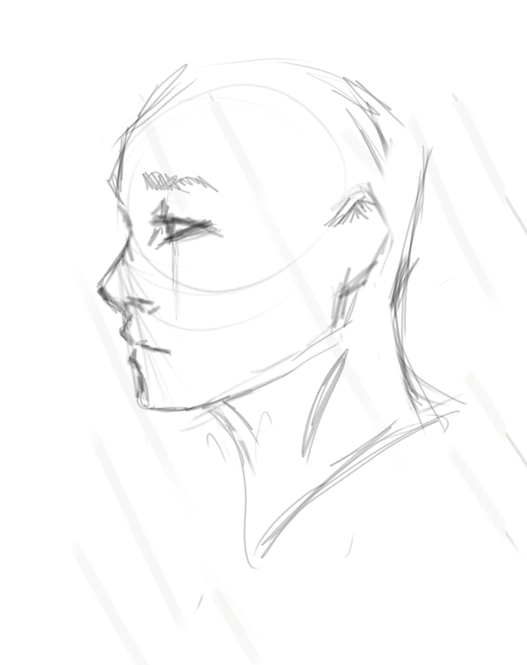
From a scroll through Miguel’s Facebook page, one can notice how nearly all of his works-in-progress reach a grayscale layer like this where he emphasizes shape, shade and lighting before overlaying colors and continuing to paint. For an example, look at his progress below: (original)

In this sketch of Harley Quinn and the Joker, Miguel has laid down his foundation for his piece, capturing the essence of the two characters and their expressions with very crisp and clean lines; even without color, one can already get a feel for how the final piece will look like. From there, Miguel begins my favorite part of his painting process: laying down the tones. (original)

Even though he describes this phase in this particular example as “Rough black and white,” he has pushed the piece from the original sketch by bringing Harley and Joker out from their white background, defining them with light and shadow. The black and white phase acts as a guide for the color, indicating where tones should be more illuminating and where they should be less prominent.
From here, Miguel places a layer of color over the black and white tones before painting over the entire image to achieve his signature soft and dreamy yet realistic textures. (original)

The importance of gray-scale intrigued me, since I never have a tonal layer in my pieces. More often than not, I find myself way too excited to draw, furiously sketching out some chicken scratch before immediately rushing in to paint over it with color. Because I rush, my paintings end up being anatomically inaccurate and contain variations of color that lead to an overall lack of unity. As an example, here are two portraits I never finished.


In the portrait on the left, the shadows on the character’s face are not defined at all; the same pinks and blushes are used for different parts of his face, resulting in zero refinement of his features. In the portrait on the right, (ignoring the fact that he doesn’t have a mouth) the tones on his face are sporadic, and I clearly didn’t think about what each color represented in terms of lighting and shade. Because I rushed, both pieces also not anatomically nor proportionally accurate.
However, after taking inspiration from Miguel, I took a step back, turned on some good ol’ music (“Blood Sweat & Tears” by BTS to be exact,) took my time and did my best to incorporate what I noted from his work into a new sketch:

Now, I’m going to be honest and say I’m still not quite exactly sure how I managed to pull off this piece. Maybe the music I played was just too good; maybe I opened myself up to this learning opportunity, or maybe I was having an especially chipper day (unlike my subject matter). While this piece is far from being fully refined, I can already see a huge difference; the intensity of the piece and the overall mood is totally different from what I’ve usually done before.
What’s most noticeable is that I’ve aimed for a more realistic painting style. (And yes, the transition from sketch to painting is always drastic for me since my progress involves painting over EVERYTHING). However, I’m fascinated by the tones in my value layer, and I have to say that painting in grayscale made the overall process of the piece go a lot smoother.
I didn’t have to worry about choosing colors for the skin, shadows, hair and eyes and making sure that they harmonized into a palette for the overall piece. Even when I quickly threw down some colors over my value layer, the lights and darks already established coordinated to each tone, which was especially magical for me.
From this study, I’m definitely appreciative of the value of grayscale — no pun intended. It was good practice for me as an artist to take a break from throwing colors on a canvas haphazardly and to step back, but I’m especially grateful to Miguel and his stunning work for inspiring me to do this! So, to everyone who made it to the end, please, please, please go check out his art on his multiple platforms (Instagram, Facebook and ArtStation to just to name a few) and send support his way!
Until then, stay tuned for my next art exploration. Have a gradient day!
All photos were used with the permission of Miguel Mercado
Categories:
The genius of Miguel Mercado
October 11, 2016
More to Discover


Lisa Zhuang • Nov 7, 2016 at 3:43 pm
It’s really interesting to look at fan art, because people interpret a character so differently and draw them accordingly. It’s cool to look at all the steps it takes in creating a drawing. I didn’t know there was a black and white stage, I thought it was really interesting how it was used.
Cute pun, btw.