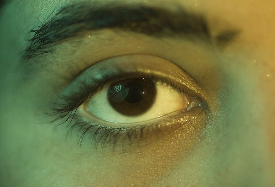
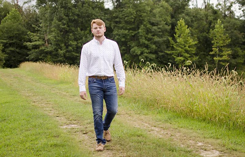
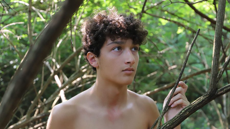
The challenge was simple: each photographer had five minutes to take a portrait of 2019 RBHS alumna and current student at Stanford Ilinca Popescu. Each of us picked a location and took photos of the same model. As far as the rules went, we were allowed to use props, we couldn’t use artificial light (except for reflectors), and we had to stay in the general vicinity of the location we were shooting at. In the end, we chose to do this to have some fun with portraits, to learn from each other and to improve as photographers.[penci_text_block block_title_align=”style-title-left”]
Shutter speed: The length of time the shutter of the camera is open, can be controlled in the camera’s settings. Higher shutter speed will let in less light, lower shutter speed will let in more light.
Aperture/f-number: Aperture is the unit of measurement that defines the size of the opening in the lens that can be adjusted to control the amount of light reaching the film or digital sensor.
The photographers
[/penci_text_block][vc_separator color=”black” style=”double” border_width=”3″]
Ana Manzano, junior — Canon EOS 80D, 50 mm f/1.8 lens
I got involved with this shoot because I wanted a challenge and knew some healthy competition against friends would push me to take better photos. I chose the plaza in the Arts District as my location because I liked the asphalt staircase, the green wall and the brick that were all in one spot. I also liked the wall there because of the grainy texture and the dark color. A photographer could pose his or her model and take a photo through the railing or play with the angles of the staircase.
Parker Boone, junior — Canon Rebel X1, 50 mm f/1.4 lens
I knew I wanted to be part of this challenge as soon as Sophie pitched it because I needed to improve at finding good compositions that fill up the frame in unfamiliar locations. Having other people choose the places we shot at was a great way to push myself out of my comfort zone, which is usually editorial style photos, while also having fun. The area I chose was the Boone County Courthouse downtown because I knew the ample natural light would give me flexibility in what I could put in the frame because no matter what part of Popescu I covered my photo would still be illuminated.
Sophia Eaton, junior — Nikon D750, 80 mm f/1.4 lens
I pitched the idea of having four photographers take pictures of one model because I wanted our newspaper staff to grow closer and learn from each other by interacting with and viewing one another’s style. I love watching peoples’ shooting processes, how they behave under pressure and how they utilize their strengths, which makes their techniques unique. I was also excited to see each individual’s editing procedure and how one’s image evolved to become an image they are truly proud of. Honestly, I didn’t even have an idea of a location when we first met. I had a few ideas in the back of my head, but I was looking for a more impulsive “Wait, that’s perfect. Let’s go there” type of decision. I desired a challenge, which eventually led to the tip-top of the parking garage during the last few minutes of sunset as we rushed to give each photographer time to shoot in the light.
Camryn Devore, senior — Canon 80D, 50mm f/1.8 lens
I wanted to get involved with this project because it is something popular I have seen done. Photographers whom I idolize, such as Jessica Kobeissi and Brandon Woelfel have participated in similar projects. I knew this would be a way to challenge myself by learning new techniques from the people with whom I was shooting. For me, one of the best ways to learn new photography techniques is through experience, and that’s why I decided I wanted to take part in this challenge. Working alongside three other talented photographers was sure to push me to produce quality work as well as learn new tricks. My location was the Broadway Diner, which I chose because it would’ve been a place I hadn’t taken pictures at before. I have always loved the aesthetic of photos inside or around diners, and I wished to create this ambiance for myself. I also knew this was going to be a very different place from the rest due to the lights on the building, so it would challenge not only me but also the other photographers.
Location one: Boone County Courthouse
[vc_separator color=”black” style=”double” border_width=”3″]
Parker: ISO 100, 1/1000, f/1.4
[penci_text_block block_title_align=”style-title-left”]
I didn’t need to add any artificial light into the photo because the natural lighting was enough to illuminate the entire frame. I had Popescu cover herself with a translucent scarf I brought so I could soften the harsh contrast the sun created. Ana held the end of the scarf over me and a reflector under the camera to light up Popescu’s face. Luckily, I captured the exact moment the scarf went over her eyes, creating a blur to the photo that I liked because it draws the viewer into the photo. [/penci_text_block][vc_separator color=”black” style=”shadow”]
Sophia: ISO 100, 1/160, f/2.0
The environment was a small courtyard garden with a few young trees and bushes surrounded by tall tan buildings. I was determined to eliminate the buildings and exaggerate our model’s green eyes with the green bushes around us. I had her sit in the bush while I aimed the camera down from above, standing on a small boulder. The reflector sat off to my side, low to the ground to provide filler light beneath Popescus chin. The hardest part of this location was the functionality. To balance on a boulder with one leg while angling a reflector with the other isn’t my ideal set up.[vc_separator color=”black” style=”shadow”]
Camryn: ISO 100, 1/600, f/1.8
Looking at this location, there were two areas Parker allowed us to shoot in; one was against the stone wall of the courthouse, and the other was a grassy patch with large rocks and browning grass. I felt within my comfort zone in this place, since it was similar to places I have previously taken photos in.
I opted for a more editorial style of posing, the style often used in fashion magazines, having our model walk along the stone wall while asking her to over exaggerate her steps. This allowed me to create movement in my photo as well as show her whole outfit. I chose the photo I did because it represents what I was trying to go for well. Popescu seems to be paused mid-stride, which created the movement I wanted in the image; on top of that, her modern outfit is perfectly in frame.
For me, the photo really seems to scream “editorial fashion,” a style of photography I have been pushing myself to work on. While there was a time limit during the shoot, I think I captured many different aspects of the spot. I took other photos in the patch of grass and incorporated the rocks, but I felt that the photo I chose better represented what I am able to do as a photographer.[vc_separator color=”black” style=”shadow”]
Ana: ISO 200, 1/160, f/5.6
My shutter speed was bit high considering my subject was pretty stable, but I used it as a way to let in less light so the photo wouldn’t be overexposed. I also knew the time limit might cause me to move quickly, so to avoid camera shake I set a higher shutter speed. These settings are pretty standard, and they stayed consistent throughout the shoot. As for posing, we had a really great model, so I didn’t need to direct her a lot. I told her where to stand and where I wanted her to put her hand, but I left the rest of the posing up to her.[vc_separator color=”black” style=”double” border_width=”3″]
Location two: Arts District Plaza
Ana: ISO 200, 1/160, f/1.8
Because I liked the background of the setting, I shot with my aperture wide open. At first, I tried to take a photo through the reflection of the door, but it didn’t work because Ilinca Popescu’s face wouldn’t focus. I still liked having the garage door as the background, so I instructed her to turn around and I took the picture. Using the clone stamp tool, I smoothed out her skin and took away some of her flyaway hairs. Overall, I’m glad I used the garage door as a background, and the final photo has a darker look than I normally strive for, but I think this darker look compliments the model very well.[vc_separator color=”black” style=”shadow”]
Parker: ISO 100, 1/160, f/2.5
I was happy with how my ISO looked in the courthouse so I chose to only change the shutter speed and aperture because the buildings in the plaza blocked the sun and made it much darker. I decreased the shutter speed to allow the camera to let more light in and I had to raise my aperture to balance it out with the shutter speed. I didn’t change my ISO at all because I wanted to reduce as much grain as possible.
I had Popescu try a surprising amount of poses for how little time was allowed, but I didn’t like how the full body pictures were turning out. By this time, I only had about a minute left and I still didn’t have a usable photo, so I ran to the other side of the plaza with Popescu and had her sit on the stairs. I loved how the stair rail framed her eye, so I used my last thirty seconds to get a great shot of that.[vc_separator color=”black” style=”shadow”]
Sophia: ISO 100, 1/160, f/1.8
Out of all locations, the art plaza was my favorite. The green color of one of the buildings matched our model’s eyes perfectly and the popcorn-like texture along with a low f/stop created a watercolor-resembling background.
Usually my shooting process involves a short amount of time spent at lots of close proximity spots; for this scene my first position remained as my last. Although Popescu said she’s never modeled before, she seemed like a natural in front of the camera.[vc_separator color=”black” style=”shadow”]
Camryn: ISO 100, 1/400, f/1.8
This was one location where I didn’t feel as though I had enough time. There were only three spots I could really utilize in my photo taking: the railing, the stairs and the lighted path. I tried to push myself to get to all three; however, I think this caused me to rush the photos I was taking.
I had a plan in my head where I was going to have Popescu hang off a railing with one hand and leg still on the rail while the other two were outstretched in a fun, playful motion, but I realized too late I had taken these photos without changing my settings, and I was unable to edit them in an appealing way.
So, instead, I opted for one of the first photos I took where she was smiling through the railings next to a brick building. In editing, I realized this is a style of photo I don’t often take.
I like to produce more dramatic and “professional” looking photos rather than, say, senior photos. I found that editing a smiling face was a refresher because I see it so little in my normal style but I did have to change my editing style to accommodate for the fine lines that appear on someone’s face when they smile. [vc_separator color=”black” style=”double” border_width=”3″]
Location three: Broadway Diner
Camryn: ISO 100, 1/640, f/1.8
Since I chose this location, I had a preplanned idea of what I wanted to shoot. At this point in the challenge, I was much more used to the three minute time limit and knew what I was able to do within that time. I first took the photo of what I had wanted coming in: a full body photo with the bright diner sign in the background. Because I had prepared for this frame earlier, I was not surprised that I ended up using this photo for the final photo. I had Popescu continuously change poses so I got a dynamic picture.
While shooting from this spot, however, I realized balancing the light from the setting sun and the red glowing sign was going to be difficult. When editing, I pulled out the red and blue tones to make the diner contrast Popescu’s outfit even more than it already did. I believe this really added to the composition of the photo by drawing the viewer’s eyes to the center of the frame. It is important that the elements of the photo lead the eyes of those seeing it to the main subject, which made the use of framing in this photo vital to how the final product would be perceived. I really enjoyed the way the final photo turned out, and I was pleased my original plan worked in my favor.[vc_separator color=”black” style=”shadow”]
Ana: ISO 200, 1/200, f/2.8
The sun was beginning to set when we took these photos, so I knew I should incorporate the sunset somehow. I decided I would take a backlit photo. To do this, I set my ISO at 200. This made the original photo dark, but I turned up the exposure and turned down the highlights in Photoshop.
I wanted to use the red staircase because the color complimented the warm tones of the photo. Additionally, the lines of the staircase added an interesting factor to the composition. The hardest part about this shoot was dealing with the lighting. The sun was setting quickly, so the lighting would change and I would need to adjust my settings to compensate. [vc_separator color=”black” style=”shadow”]
Parker: ISO 100, 1/800, f/1.4
At the diner I found there to be few interesting ways to frame my photo, so I backlit Popescu because the sun gave off warm colors. It was a surprisingly well-lit area for how late in the day it was, so I had Popescu sit at a table outside of the diner and lean on her arm on the table.
This was a simple pose that didn’t take up too much time to set up and it added interaction between the subject and the background. My favorite part about taking this photo was capturing the retro aesthetic of a diner in a modern setting. [vc_separator color=”black” style=”shadow”]
Sophia: ISO 80, 1/125, f/2
The sun was beginning to set, and we were running out of time. That, combined with the fact that I hadn’t decided on a set location yet, made for a tense few minutes. I wasn’t concentrating on the actual photography. I was focused on the timer counting down, anxiously awaiting the next time announcement.
This was the third photo I took in the first few seconds. The colorful 60s diner and black biker jacket reminds me of West Side Story. It’s easy to tell I took the photo close to sunset because of the golden highlights and general glow on our model’s skin.
Overall, this is the photo I’m most disappointed in. The location held a lot of potential with its fun pops of color and ideal lighting due to the time of the day, but my nerves got the best of me.
In the end, I wish I spent more time planning where I was going to shoot, angles, poses, etc. I didn’t make the same mistake at the location, although the next location was decided spur of the moment, I took the time to take in my surroundings and think through my angles.[vc_separator color=”black” style=”double” border_width=”3″]
Location four: Parking Garage
Sophia: ISO 80, 1/125, f/2
Finally, it came to my location. I was looking to challenge myself and my peers, originally joking that we would shoot around some nearby dumpster. As we were walking back toward downtown, I noticed almost everything was cast in a shadow. I wanted the rare golden hour glow that shines for only a small amount of time each day, so we needed to get somewhere elevated, and quickly, as the sunlight had begun to fade. The parking garage across the street was high enough to free itself from surrounding shadows and I usually see it as a dark and boring site due to its common use: parking cars for long periods of time. I had found our challenge.
We raced up the stairs and immediately started the timer. With numb fingers, we did our best to find the camera trigger. Popescu’s full hair is perfect for backlit photos as it catches light well and provides a soft glow around her face. I had her sit upon the ledge and aimed toward the setting sun. I think the grey concrete jungle around us led to what I wanted from my scene, a challenge. [vc_separator color=”black” style=”shadow”]
Ana: ISO 200, 1/200, f/2.5
The parking garage location was difficult to shoot at. The light from the sunset was hard to work with because it was so harsh, and the asphalt made for a dull background. I tried to search for a background with more color, and found the bright yellow parking bollard and matching “pay machine” sign perfect.
I needed to make her interact with the background, because I felt like it would make for a more interesting shot than her simply standing in front of the gray wall. To be honest, I didn’t notice the yellow line on the floor until I looked at the photo in post, but when I did, I knew it worked perfectly.
Parker: ISO 100, 1/1000, f/1.4
[vc_separator color=”black” style=”shadow”]
When Sophie told everyone the location she chose was the top of a parking garage, I was extremely skeptical. I spent most of my five minutes confused and frantically thinking about how I could make this setting look good, but then I realized I could use the barbed wire fence as a barrier between the audience and my subject by placing Popescu behind it. I kept my settings similar to what they were when I was in bright daylight because it reinforced the dark and dull photo I wanted. During post processing I used the grain tool in Lightroom to add texture in Popescu’s face because it enhanced the rundown atmosphere of the picture.[vc_separator color=”black” style=”double” border_width=”3″][Total_Soft_Poll id=”16″]What was your favorite location in the challenge? Let us know in the comments below.[penci_authors_box_2 style_block_title=”style-title-11″ columns=”columns-4″ post_desc_length=”20″ number=”4″ order_by=”user_registered” include=”15, 14, 67, 4″ block_id=”penci_authors_box_2-1586926207688″]

