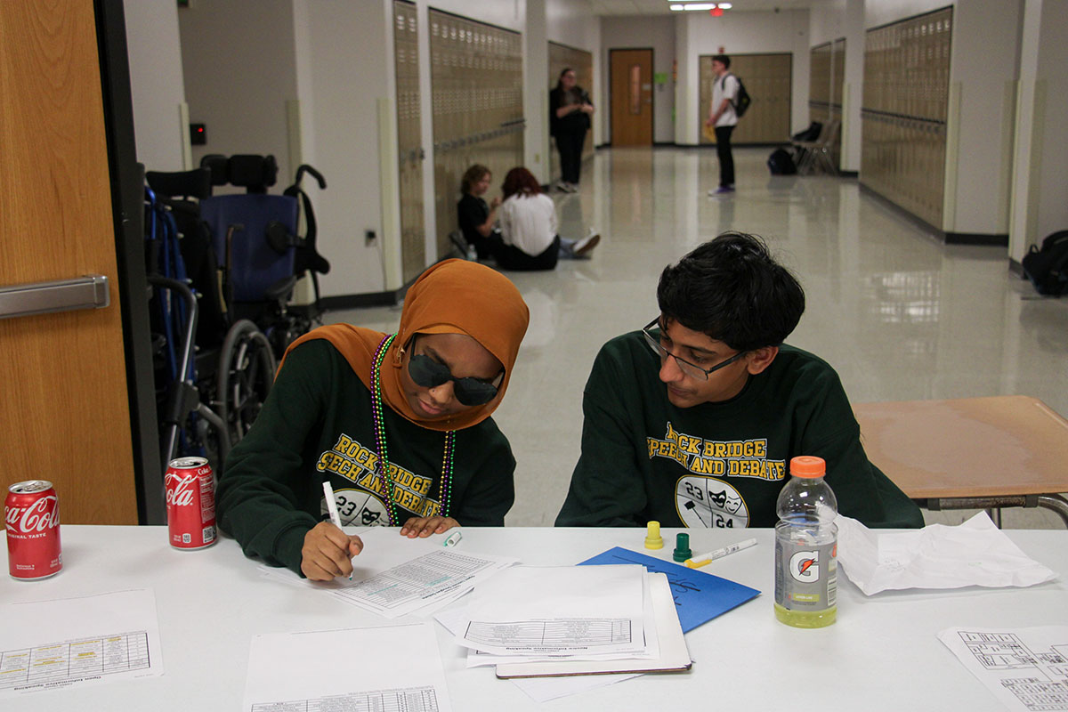
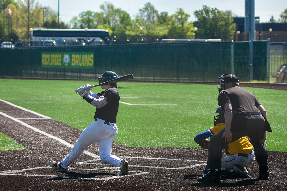
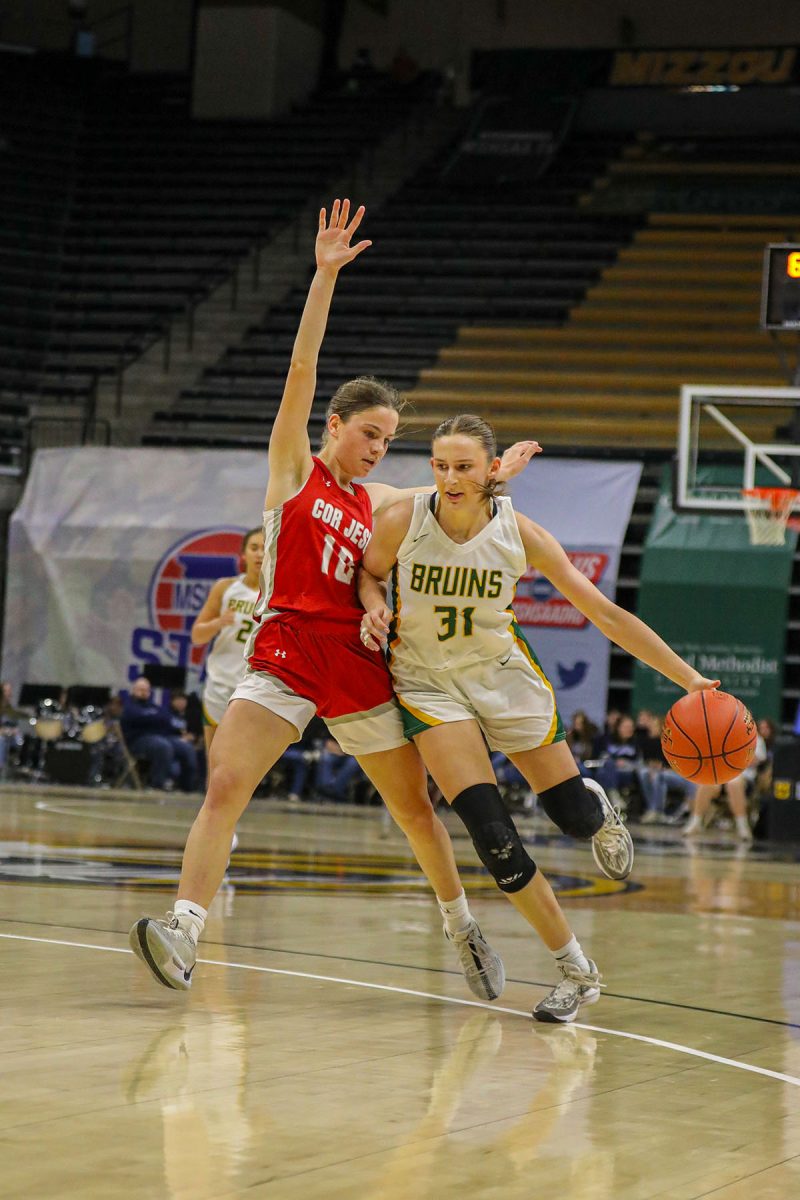
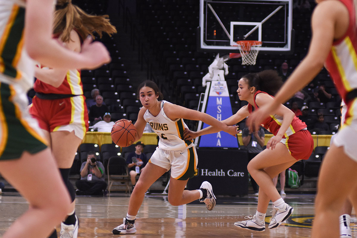
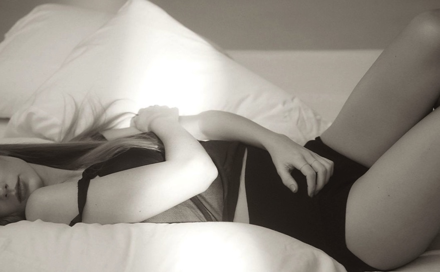
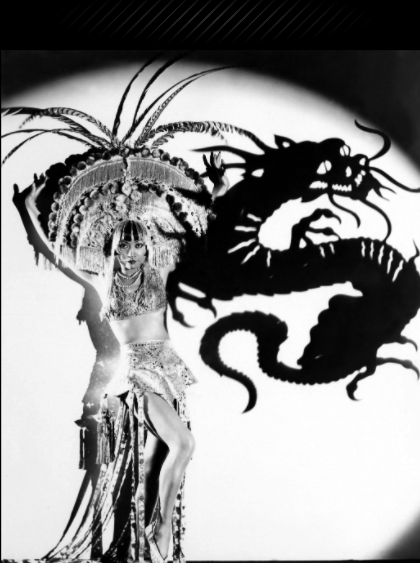
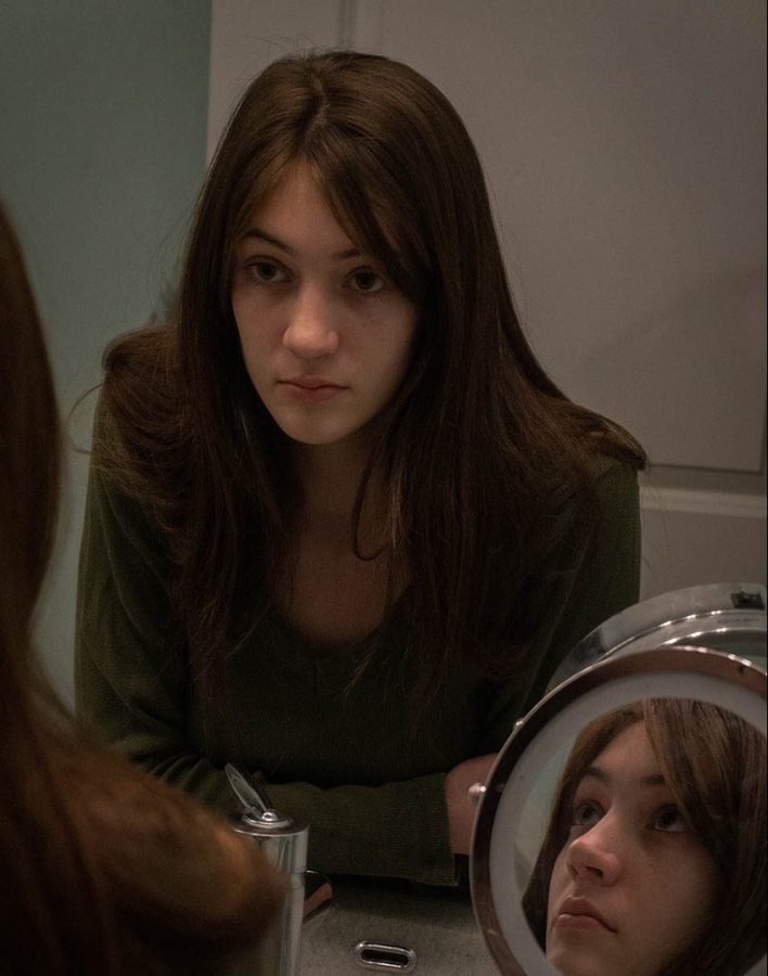
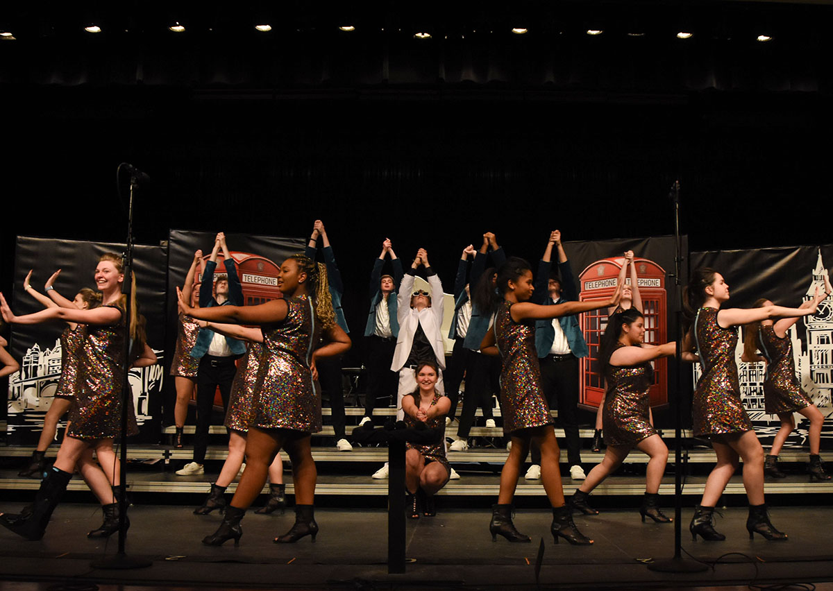
The ability to shoot manual is one of the most necessary skills of a great photographer. Knowing how to properly light a photo, however, is only part of what it takes to produce amazing photos. In order to make the subject of the photo more interesting, it is important to know where to place him or her in the photo to make it more aesthetically pleasing to the eye.
If you have taken art or any photography class, you have likely heard of the “rule of thirds.” This is a simple rule that vastly improves photo composition. When applying this rule, picture the photo divided into three sections vertically and horizontally by two vertical lines and two horizontal lines. Then, use this grid by lining up the subject with the lines and, if possible, lining up other aspects of the image with the other lines. This can be done by using the grid line present in the viewfinder of a DSLR (can be changed in settings) and can be improved when cropping during editing. When cropping a photo, most photo editing softwares, such as Adobe Lightroom or Photoshop, will show a rule of thirds grid in order to help properly crop.
If a horizon line is present, lining it up with either the top or bottom horizontal line can take a photo a step further. Additionally, if there are two subjects or a human subject looking towards an object, line the two up on opposing lines. When taking a horizontal photo in with a good portion of a human subject in frame (as will be the case many times in sports), sometimes lining up his or her face with one of the top cross sections of the vertical and horizontal lines can help draw the observer’s eyes to just the right place and add lots of perspective to the photo.The photo above of a tennis player demonstrates great use of the rule of thirds. As you can see, the player herself is completely lined up with the left grid line while her face is located at the top left cross section. Furthermore, the “horizon line” behind her is lined up with the lower line along with her hand and the tennis racket. A person’s eyes are directly drawn to the player because of all of this, mainly to her eyes, which then guide the observer to the tennis ball, which, while not perfectly lined up, is approaching the top right cross section.
The example above is an amazing use of the rule of thirds grid. It is not necessary, however, to have that much line up in one photo to greatly improve it. Even using only one line to line up the subject left and right will take the photo’s composition to the next level. It will take some practice to constantly think about photo composition while shooting, but it will enhance anyone’s photography.
f/ramed
April 9, 2017
0
Tags:
More to Discover


